BRAND
PROJECT

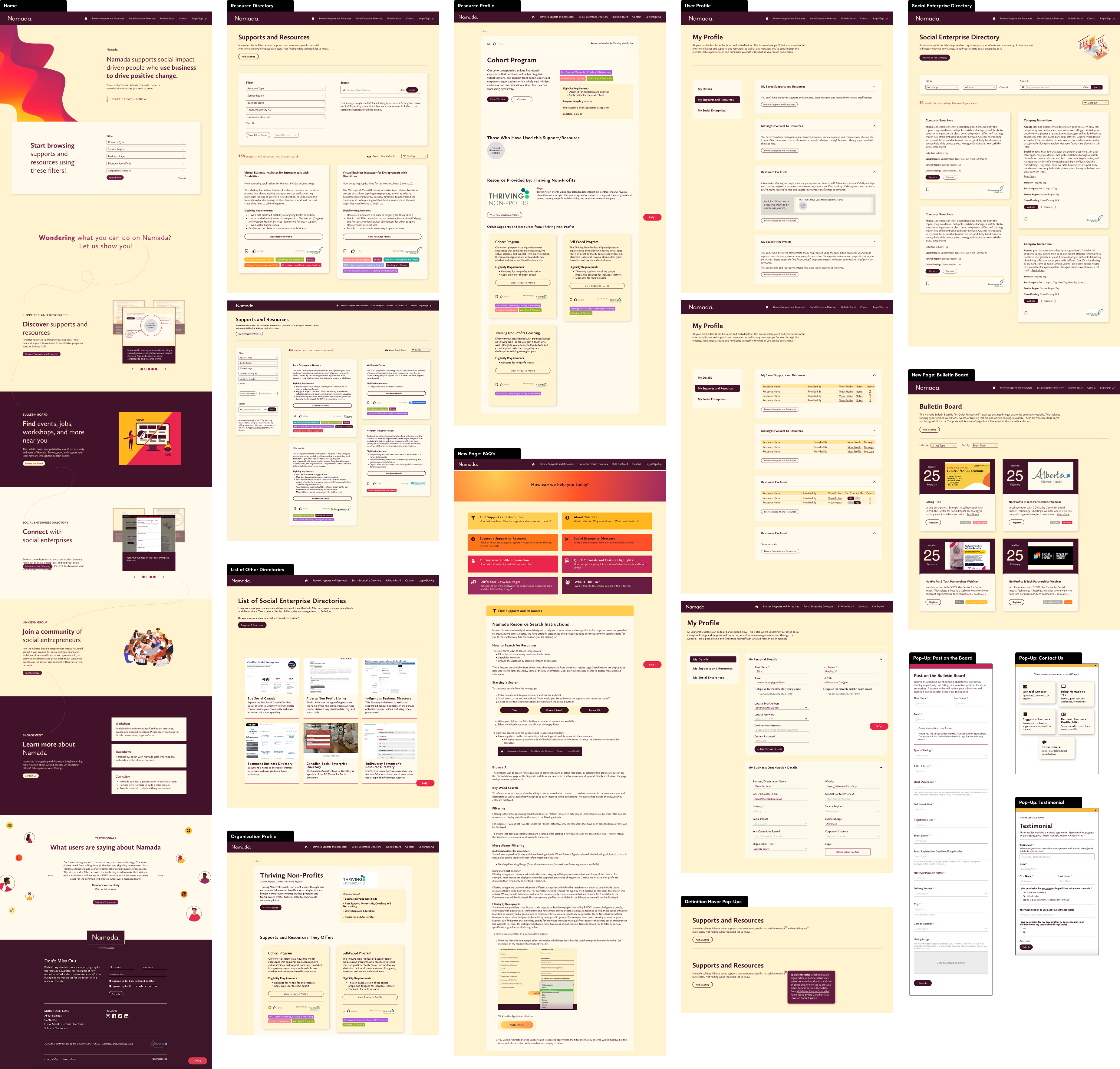
Leading the Design of Namada's Website

SUMMARY

This is the story of how Namada’s digital product came to be. It covers how the product was built using human-centred design, the goals we wished to achieve with the product and how design decisions helped us achieve those goals. As the lead designer for Namada, my main priority was to make sure that we were creating a tool that was a response to the needs of our community.

RESPONSIBILITIES

UI Design in Figma

Development in Bubble.io

User Testing

Web Strategy

Starting from Scratch
Namada was the epitome of “building a car while we drive it”. When I was hired onto the team as their lead product designer all that had been decided was that we were to create some type of tool that would help social entrepreneurs and small business owners learn about the resources available to them. It was up to myself and a small team of three to dive into research and really learn about the needs of these entrepreneurs and build a tool to meet them.
Human-Centred Design Approach
There were two of us who reached out to many local entrepreneurs and planned and hosted focus group sessions. We discovered many gaps in the system and what our tool could offer that would begin filling some of these gaps. The key themes we heard expressed were: a welcoming place where entrepreneurs could connect with one another to hear about their experiences using various support and resource services; a place where they could go to read about all the resources available to them; and a place to connect directly to resource providers with questions.
Building the Tool: A Focus on FUnctionality
We took these three main goals and ran with them. The tool sought to be the solution to spending hours on google researching available resources and even more hours putting together applications only to find out you weren’t eligible.

This tool was built in partnership with the Government of Alberta and AB Seed which was a non-profit governed by a steering committee. There were quite a few people who were invested in this tool and who we required sign off from for each phase of the project. They were most heavily involved in the ideation and functionality of the tool though. As such, once we completed our focus group sessions and had a good idea of what type of tool would best serve the community I created some very simple wireframes in Figma to demonstrate what users could do on it and what type of information we would display. You can see these wireframes below.
The main components of the tool at this stage was a filterable searchable resource database and a self populating social enterprise directory. We built in the functionality so users could contact these resource providers right from the site saving them the step of searching for the correct contact information and opening their email to craft a message. We also heard in these focus group sessions that entrepreneurs wanted to be able to contact each other and learn about each others businesses. We built the social enterprise directory to meet this need of learning about each others businesses and we also added a feature on the resource profiles where entrepreneurs could identify if they'd used that resource before and if they're open to being contacted about their experience.

I led the wireframing and feedback sessions on the functionality with not only our team of three, but also with the stakeholder group of this project which consisted of representatives of the Government of Alberta and key community partners from The Social Enterprise Fund, Trico Foundation, and United Way Calgary.
Naming Process and Branding
After completing the functionality wire framing, feedback sessions, iterations and more feedback sessions, it was time to name and brand this tool. I was tasked with doing both of these and we started with a lengthy naming process to get a good idea of how users wanted  to feel when interacting with the site. These were the grounding principles that I based the branding choices on. 

We heard from users that they wanted to feel welcomed and calm when using the site and to leave feeling like they just took a breath of fresh air. To evoke a feeling of welcome I chose colours that were warm and inviting. Deep burgundy, reds, oranges, and yellows all mixed together into a war deep main design element. This element I call “the wave” has lots of movement to it to reflect the idea that Namada is helping users move through their business growth journey. To evoke the feeling of calm I chose soft, rounded elements in the icons and illustrations as well as in a soft font - staying away from anything with overly sharp angles and edges. The breath of fresh air comes with using the site and the content it provides. The key purpose of the site was for users to be able to find supports and resources much much faster than a google search and we made sure to spend lots of time on the filtering abilities to help users find said resources on our site as fast as possible. With the goal that they leave the site quickly and can breathe a sigh of relief knowing there’s resources out there, they can quickly start the application process, and can get some precious time back in their day. 
Bringing it all together for a beta launch
As the title of this section suggests, we brought together our agreed upon functionality and the branding to create a beta version of Namada's digital product. Seeing as we were building the car as we drove it, we launched a beta version of the site knowing that it wasn't quite 100% to it's max ideation and functionality but really wanted to get this tool into the hands of users and begin to see how people were interacting with it. We studied how people were using the tool, conducted user test sessions and continued to iterate and tweak the site. During this time I was leading all of the design work, user testing sessions, as well as feedback sessions with our stakeholder group.  

I built these initial designs in Figma and the developer on our team developed them out on Bubble.io. It made more sense to have me do some of these small design changes and tweaks right in the Bubble editor as we were on a tight budget and timeline with lots of work to complete. Throughout this process I did learn a good deal about using Bubble.io and no code development and data connections.

What you see below are various versions of Namada from the Beta launch up until we launched Namada 2.0 which you can read about further down.
Presentations
Once Namada was launched, there was a huge boom in interest and we were being asked to present our process and the tool itself at a variety of events. We were asked to present at Universities entrepreneurship classes, the Social Enterprise World Forum: Alberta Hub, Social Venture Institute: Alberta, other local events and even at local businesses staff meetings. 

People were wanting to know how they could benefit from using the tool as well as how they could promote it to their clients and users as well. I was one of the presenters at a variety of these events and was the primary designer for the presentation decks themselves helping to visually showcase our journey and the benefits and features of using Namada. 

We received amazing feedback during these sessions from users telling us how much Namada has helped them and saved them time (goal achieved!) as well as new ideas for future functionality and improvements.
Namada 2.0
These presentations and the feedback from there guided our improvements and build of what we called Namada 2.0. We added new pages including a self-populating bulletin board, a FAQ’s page, and a list of other useful directories out there. We improved on the filtering designs for the supports and resources page as well as added a filtering functionality into the social enterprise directory. We did a thorough scan through the site and revamped the functionality of many elements making them more intuitive to use and easier to find. Another notable change was the user profile, giving users a much cleaner experience seeing their saved items and messages they’ve sent through the site. And of course we did a complete redo of the home page to better reflect the features of the website.
A Focus on Responsive Designs
The beta version of Namada was built on a very tight timeline. By the time we started design to soft launching the product we only had about two months to do it. Which didn’t leave us much time to make a highly mobile friendly version so we spent a lot of time improving the responsiveness of everything on the site before launching version 2.0. 
Looking Forward
Hope to create many lenses i.e. Indigenous pilot program. Can be a replicable idea for different provinces or focuses.