BRAND
PROJECT

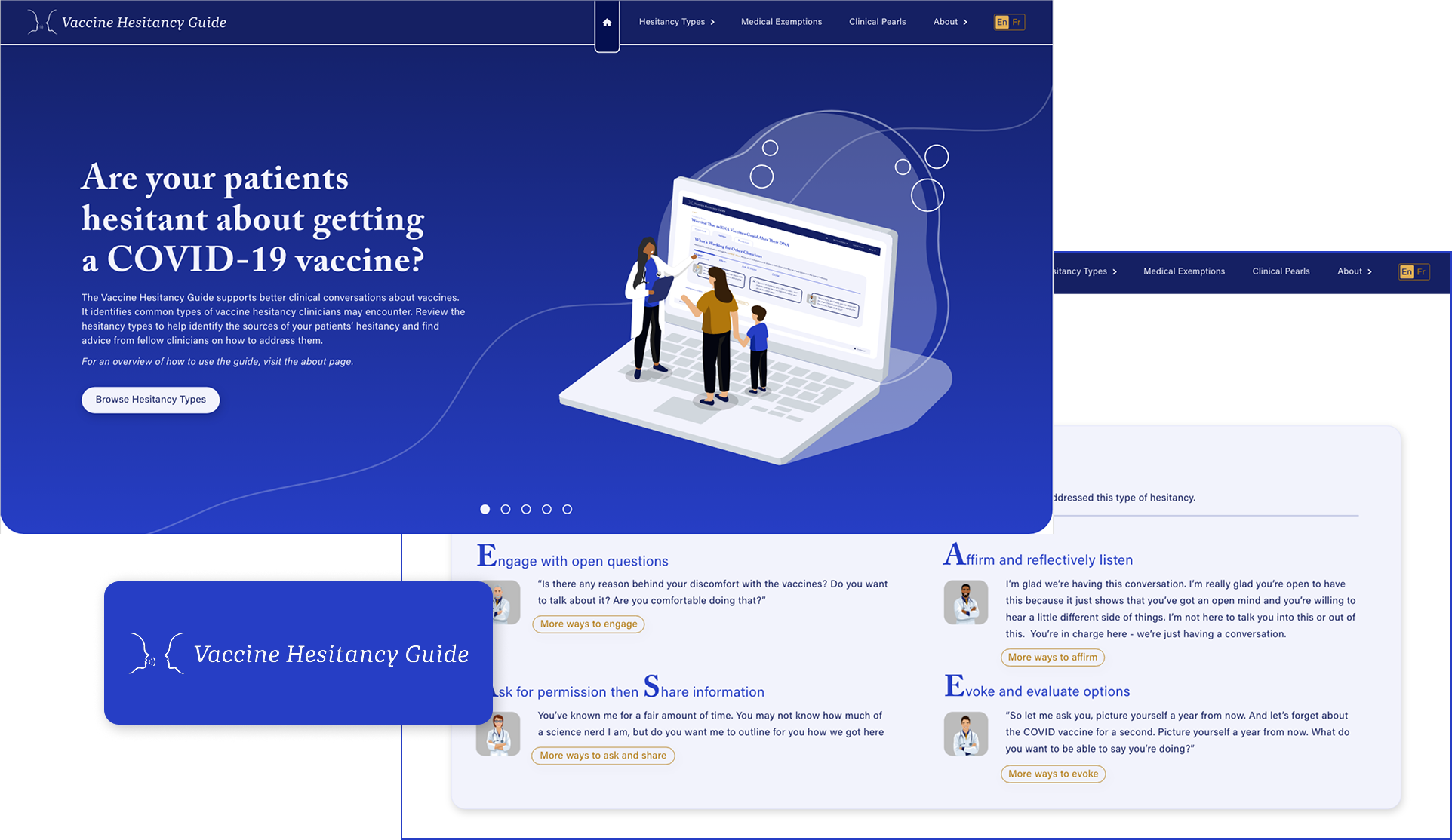
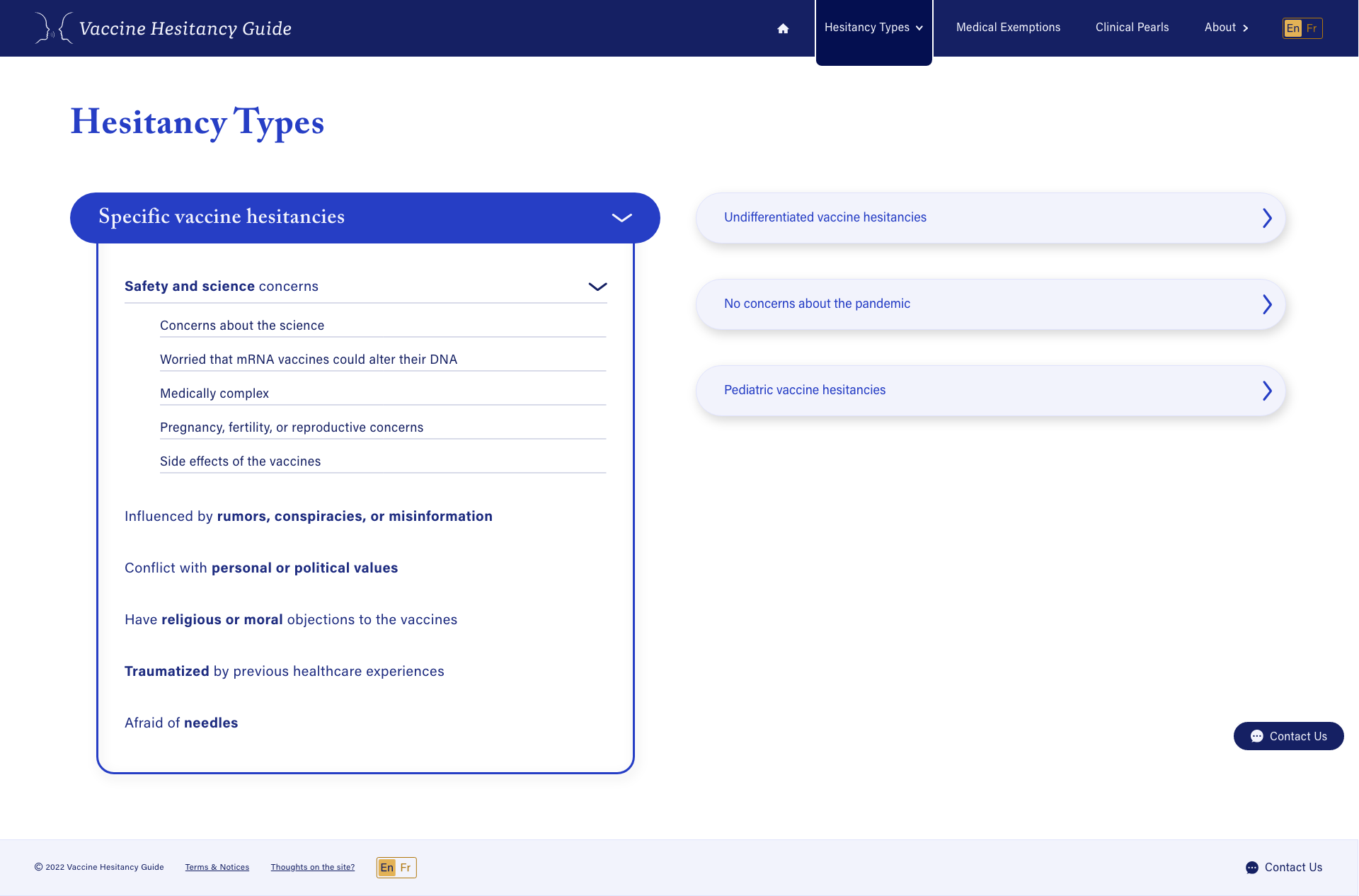
Helping Physicians Navigate New Conversations

SUMMARY

Below you’ll hear about how we built the Vaccine Hesitancy Guide. From the challenges we faced to the design decisions we made to address them. As the only designer on the team, I was responsible for all visual UI of the site as well as user testing the product.

RESPONSIBILITIES

UI Design in Adobe XD

User Testing

How it started
The Vaccine Hesitancy Guide was created as a response to the COVID-19 vaccine rollout and the various questions and conversations patients were having with their physicians. Physicians were facing new conversations they’d never had to navigate before and each conversation required a tailored approach. The Guide was created as a response to this need by providing physicians with advice, conversation starters, and resources for 15 hesitancy type personas. The guide was not built to be a tool to convince people to receive the vaccine but a tool to help physicians address their patients concerns and questions in an un-biased manner.  
Content, content, and more content
A very evident challenge I was to have when designing the guide was the sheer amount of content we had for it. There was so much content to work with and I knew it had to be designed very strategically so it wouldn’t overwhelm the user but rather guide them through the information in a very specific way. We achieved this by breaking up the content of each persona into 3 main ‘tabs’ as we called them: an overview section, an advice section, and a resources section. Each tab provided a snapshot of the full extended information they could dive deeper into if they wanted to or had time to. This way physicians could reference the guide quickly during conversations using the overview content and provided them with further content to explore when they had more time.
Many menu options
Having lots of content to work with meant having lots of menu options to work with as well. There were 15 hesitancy types total that needed to be grouped and categorized. We were able to group these 15 types into 4 overarching categories so that we could guide users to the persona they were looking for rather than overwhelming them with decision paralysis looking at all 15. These 4 categories were selectable from the navigation bar and once they selected one, depending on if it had any subcategories or not, they would be brought to a secondary menu page where they could then browse the subcategories that had also been grouped into overarching themes. You can see how I designed this user journey in the following images.
Responsive Design
From the very start of this project it was very important to us that the guide be responsively built to accommodate the content on any size of screen. We knew physicians could be accessing the guide from any type of screen, ranging from a mobile device to an office table to a laptop or desktop and everything in between. We also knew some of the office screens could be older displays with strange dimensions and wanted to make sure the experience of using the site was smooth no matter what device they were accessing The Guide from. I really thought about how the content would resize with every layout I created and opted for layouts that lended to a smooth resize.

Colour choice was another piece of the design that was in response to not knowing the age of the device people were accessing The Guide from. We knew some of these screens could distort the colours poorly and we wanted to make sure that it didn’t result in the content being illegible. We tested many colours and chose a primarily two tone colour design to minimize the possibility of the content becoming illegible if the screen distorted the colours.  
Building Credibility
During the time we built The Guide there was a multitude of information swirling around and many discussions about what information was credible and not. The content on The Guide was compiled and written by a research team from the University of Calgary's School of Public Policy who interviewed and had many conversations with primary care clinicians. It was highly credible information that was collected and it was important we communicate that to users of the site. I did this by having a focus on who wrote the guide, the process of gathering the information, and the media coverage the guide had received as a result of this right on the home page so users would be able to tell from the very beginning that this information was gathered by and from a credible source.
Timeline challenges
The idea for the guide sprouted up quite quickly after the vaccine was first introduced and physicians were looking to have this tool in their hands as quickly as possible. The content was relevant right then and there and we knew it would become less useful the longer it took us to get the guide created. As such, we were on a tight timeline!

The guide was being coded by a developer which meant less wiggle room for changes in design once they were passed off to him because we couldn’t afford to spend time re-coding elements unless it was crucial to the user experience. This meant I had to really nail the designs and be very confident they were achieving the desired outcomes and produced a highly positive user experience. Once I had the core of the design created in Adobe XD I conducted a series of user testing with physicians and non-physicians alike to make sure the guide wasn’t confusing to use, that it was clear what type of information could be found where and that users weren’t getting lost within the layers of design. We made sure to do this prior to developing the designs and made changes accordingly based on the feedback we received during these user testing sessions.
Reflecting on the designs
Looking back at the designs for this project I see a few areas we could have improved on. One of which is adding more context content (you’re probably thinking, more content, are you serious?) and the answer is yes! I would have included more context content to better explain what users were looking at. For example on the “vaccine hesitancy types” menu page I would add some text under the header to explain that we gathered information on how you can approach various conversations with patients and built persona's around the main types of conversations we heard physicians having and split these up into themed categories they could browse to find the persona that most represented the hesitancy's their patient was talking to them about.

Another change I would have made is adding “breadcrumbs" onto the hesitancy type profile pages to improve the user way-finding and give users a better understanding of what layer they were on when looking at a profile. As in were they on "level 1" looking at the Undifferentiated Hesitancy Type, or were they on "level 3" looking at the Specific Hesitancy Type > Safety and Science Concerns > Concerns About the Science. This would have helped users to understand the structure of the hesitancy types and give them a better sense of the journey they took to get to the page they were on and give them a simpler way to go back to previous "levels".