BRAND
PROJECT

Transforming Edmonton's entrepreneurial ecosystem

SUMMARY

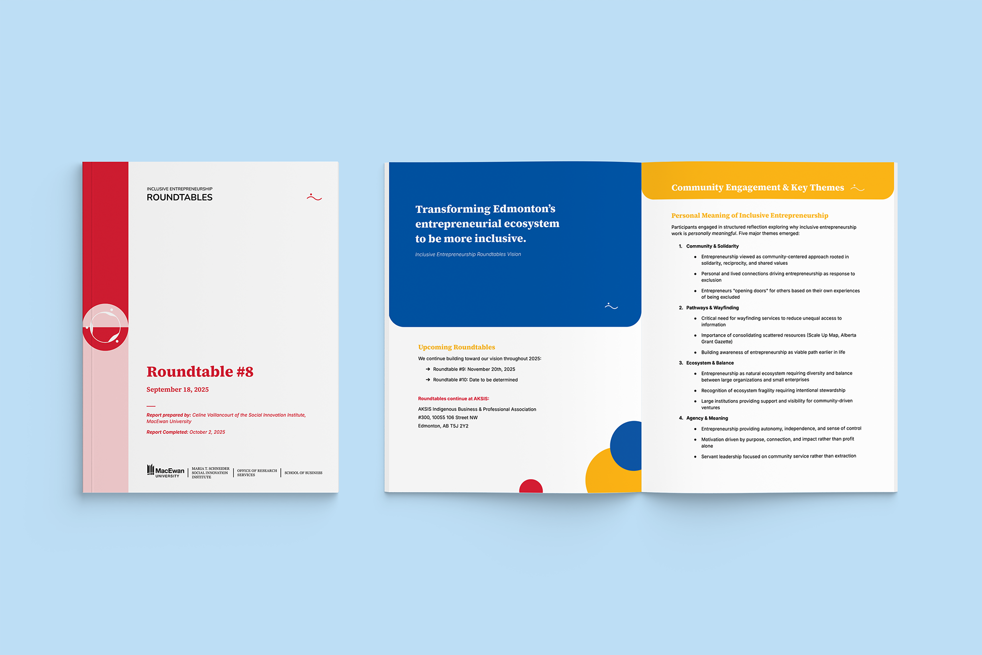
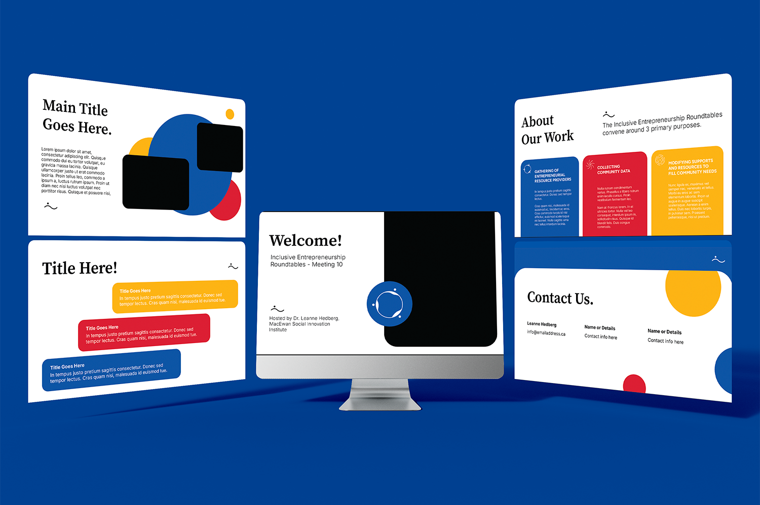
The branding for MacEwan University's Social Innovation Institute's initiative, the Inclusive Entrepreneurship Roundtables, is grounded in the principles of community, inclusion, and growth. Below you'll hear and see how I built these principles into their branding and document templates.

RESPONSIBILITIES

Brand Strategy & Development

Template Design

How it started
The Inclusive Entrepreneurship Roundtables are gatherings of resource providers dedicated to transforming Edmonton's entrepreneurial ecosystem to be more inclusive and impactful. They achieve this through 3 main goals: enable trust amongst community partners; collect, analyze, and share data from minority groups; use this data to influence policy and ecosystem change. The Roundtables bring together a community of people that might not otherwise meet to work together creating stronger outcomes for the community. My job was to create a brand that represented their goals of inclusivity, growth, and community.
Logo Option One
Option one symbolizes people gathering. It's only when they come together do they form the overall visual of the circle. Much like how the Roundtables brings together a community to create something stronger and bigger than they can individually. It's a soft font paired with smooth lines in the icon to feel gentle and approachable, giving the overall vibe of welcoming and inclusive.
Logo Option Two
Option two has a more subtle, abstract nod to people connecting. It's less visually representative of people gathering rather more about people connecting with one another through the cursive font of "ier". It utilizes the same soft font and also has soft curves for a gentle welcoming approach.
Selections and edits
I paired both these logo options with the colours and typography shown on the left side of the image below. My initial design concept chose two primary fonts that were accessible on all platforms, simple, conventional in style, but unique to the IER brand. As well as three primary playful colours. During our brand presentation discussion we decided it would be best to subtly connect visually the IER with MacEwan University since they are the backbone of this initiative. We chose logo option one to uniquely represent the IER and then changed the colours and typography to match the MacEwan brand guidelines as a way to bridge the two organizations.  
Templates
The second piece of this project was to develop some documentation templates that gave the IER autonomy to edit and add content. I created a letterhead template, report template, and slide template all in both Microsoft and Google Suite formats for ease of use and accessibility.

I added all the graphics into these templates as well as re-created them in Canva so they could make edits to them should they need to. This way they have full access to edit all parts of the template if they need it. As a small organization who has multiple priorities it was essential to create systems that were simple for them to use and quickly accessible.
Slide template
Report Template
GRAPHICS
As previously mentioned, the IER has three primary pillars of their work that can be synthesized into the themes of gather, learn, and change. I developed an icon to pair with each theme so as they have work that is representative of these pillars they can visually connect them to a set colour and icon. This helps to keep the consistency and continuity of content as they share it out with their networks.

I also developed a sub-icon of their primary logo icon that can be used as an accent in their visuals. It adds an element of personality and playfulness to their designs that draws users in.